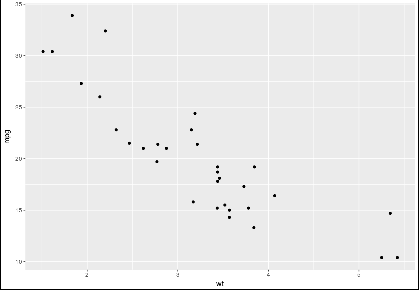
built-in plot
> library(ggplot2)
> qplot(mtcars$wt, mtcars$mpg) # qplot: quick plot
> qplot(wt, mpg, data=mtcars) # 같은 결과, 다른 문법

> # This is equivalent to:
> ggplot(mtcars, aes(x=wt, y=mpg)) + geom_point()
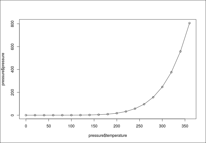
내장 라인 그래프(built-in line plot)

# 라인 위에 점을 추가하는 방법
> plot(pressure$temperature, pressure$pressure, type="l")
> points(pressure$temperature, pressure$pressure)
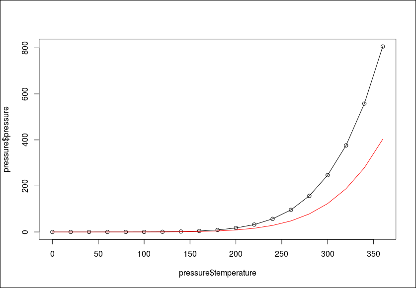
## 빨간색 라인 그래프

> lines(pressure$temperature, pressure$pressure/2, col="red")
> points(pressure$temperature, pressure$pressure/2, col="red")

ggplot2 line plot
대부분 실무에서 qlot보다는 ggplot를 사용함
> qplot(pressure$temperature, pressure$pressure, geom="line")
> ggplot(pressure, aes(x=temperature, y=pressure)) + geom_line()

# 라인과 점
> qplot(temperature, pressure, data=pressure, geom=c("line", "point"))


# ggplot의 장점은 그래프 기본을 지정해주고 나머지 속성들을 뒤에 +로 조합해서 그릴수 있는것이 강력한 점이다.
> ggplot(pressure, aes(x=temperature, y=pressure)) + geom_line() + geom_point()
built-in bar plot
BOD는 demand와 time으로 구성됨
> BOD
  Time demand
1    1    8.3
2    2   10.3
3    3   19.0
4    4   16.0
5    5   15.6
6    7   19.8

> barplot(BOD$demand, names.arg=BOD$Time)
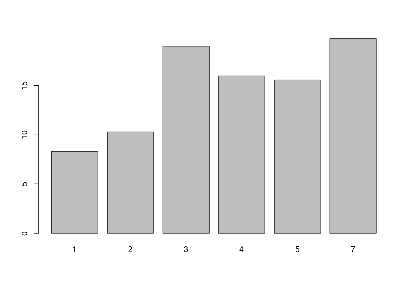
카운트 값을 y축을 잡음
ggplot2 bar plot
> library(ggplot2)
> qplot(BOD$Time, BOD$demand, geom="bar", stat="identity")
> # Convert the x variable to a factor, so that it is treated as discrete
> qplot(factor(BOD$Time), BOD$demand, geom="bar", stat="identity")

# factor로 변환하는 방법
> qplot(factor(Time), demand, data=BOD, geom="bar", stat="identity")
> # This is equivalent to:
> ggplot(BOD, aes(x=factor(Time), y=demand)) + geom_bar(stat="identity")

> qplot(mtcars$cyl)
stat_bin: binwidth defaulted to range/30. Use 'binwidth = x' to adjust this.

# Treat cyl as discrete
> qplot(factor(mtcars$cyl))
> qplot(factor(cyl), data=mtcars)
> ggplot(mtcars, aes(x=factor(cyl))) + geom_bar()

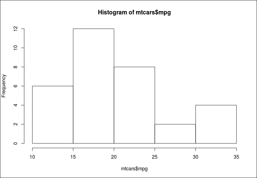
히스토그램
기본 히스토그램
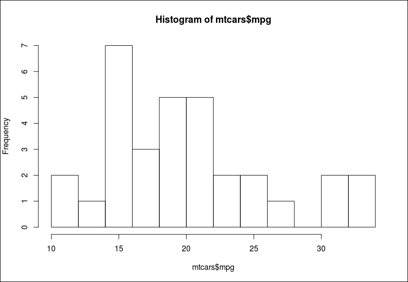
구간을 10개로 나누고 싶을 때
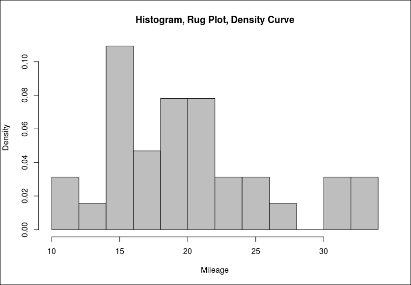
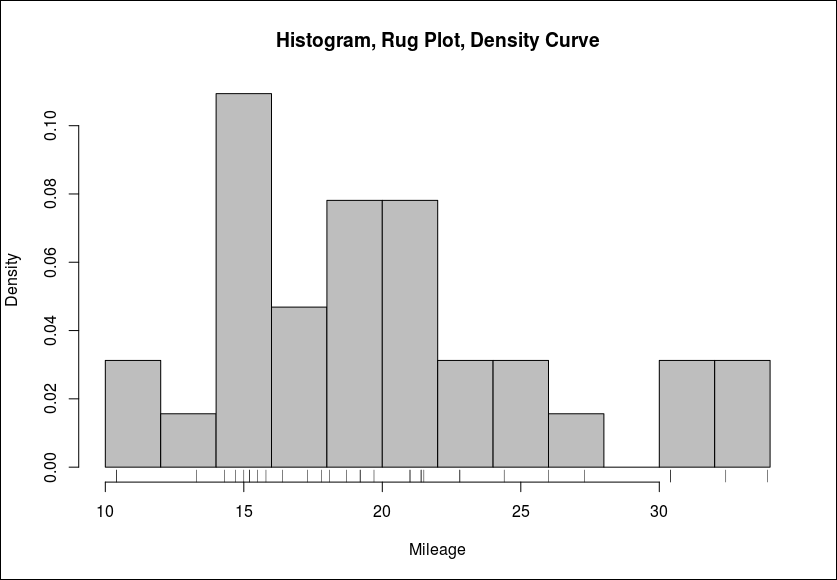
히스토그림, rug plot, 라인그래프를 같이 그릴 때
> hist(mtcars$mpg, breaks=12,
      freq=FALSE, col="grey",
      main="Histogram, Rug Plot, Density Curve",
      xlab="Mileage")
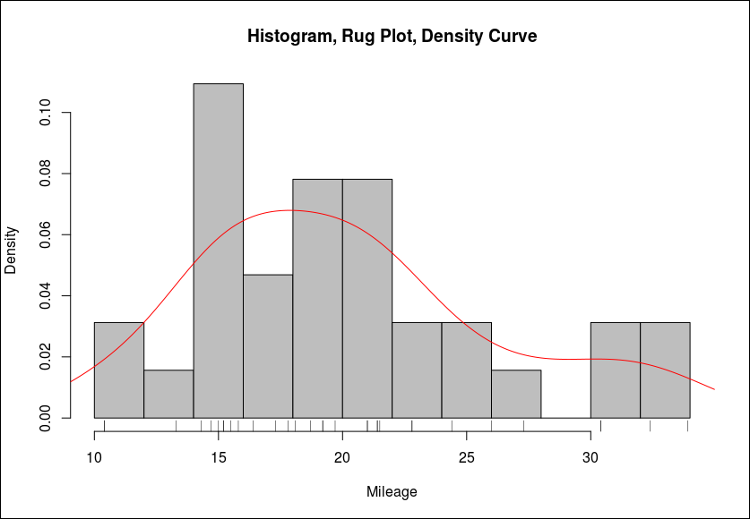
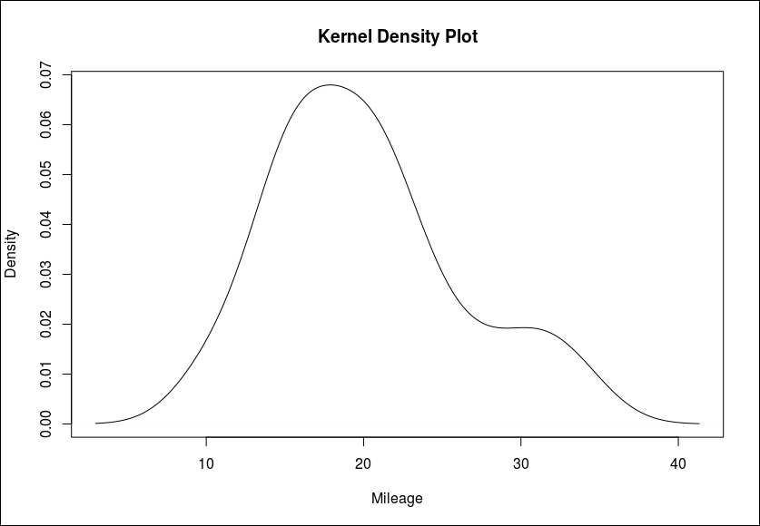
모집단 그래프
> dens <- density(mtcars$mpg) # 전체에 대한 분포를 추정함
> plot(dens,
        main="Kernel Density Plot",
        xlab="Mileage")


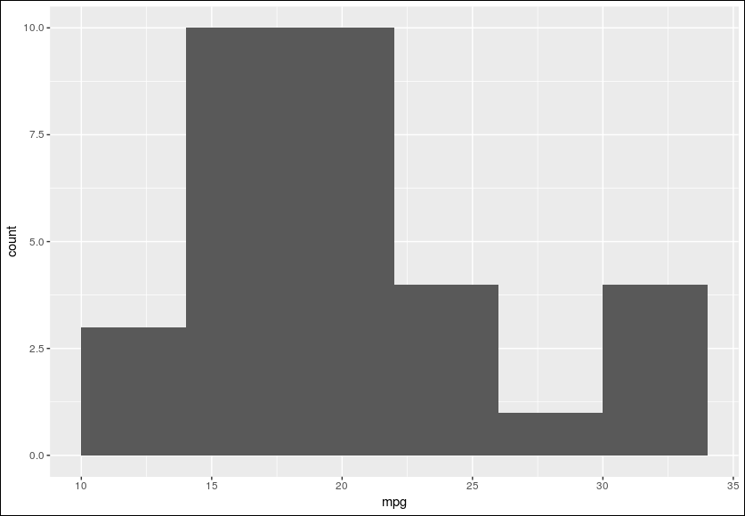
> library(ggplot2)
> qplot(mpg, data=mtcars, binwidth=4)
> ggplot(mtcars, aes(x=mpg)) + geom_histogram(binwidth=4)
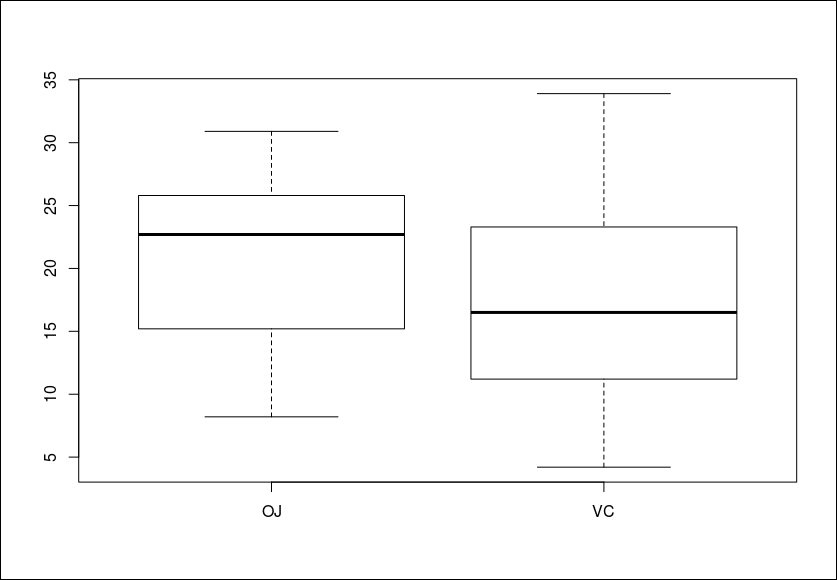
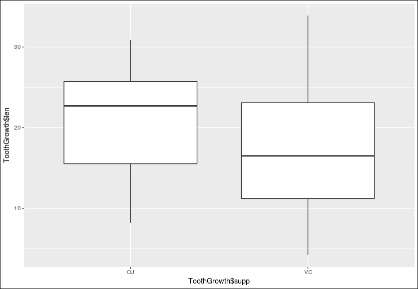
box plot
outliers detection 할때 많이 사용함.
> ToothGrowth
    len supp dose
1   4.2   VC  0.5
2  11.5   VC  0.5
3   7.3   VC  0.5
4   5.8   VC  0.5
5   6.4   VC  0.5
6  10.0   VC  0.5
7  11.2   VC  0.5

> plot(ToothGrowth$supp, ToothGrowth$len)
If the two vectors are already in the same data frame, you can also use formula
syntax. With this syntax, you can combine two variables on the x-axis:
Formula syntax
2개 변수의 조합을 x축으로 사용
> library(ggplot2)
> qplot(ToothGrowth$supp, ToothGrowth$len, geom="boxplot")
If the two vectors are already in the same data frame, you can use the following
syntax:
> qplot(supp, len, data=ToothGrowth, geom="boxplot")
> ggplot(ToothGrowth, aes(x=supp, y=len)) + geom_boxplot()
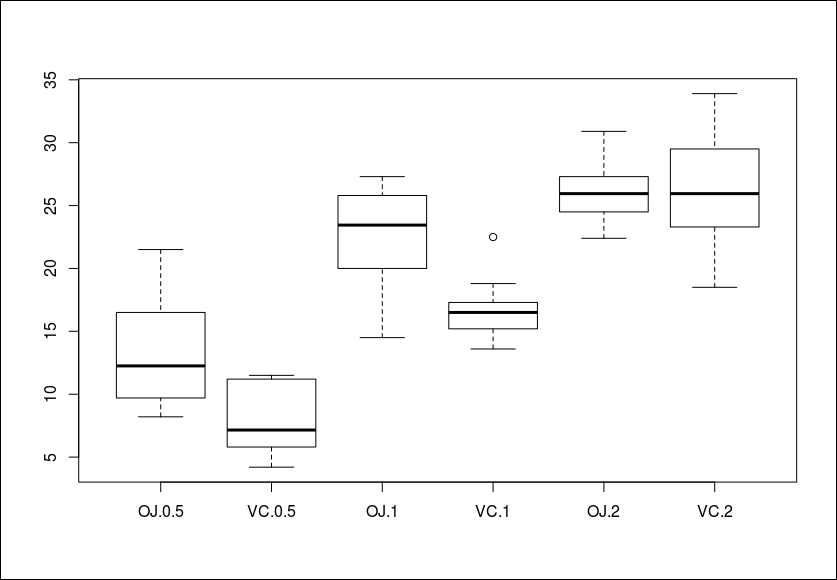
It’s also possible to make box plots for multiple variables, by combining the variables
with interaction():
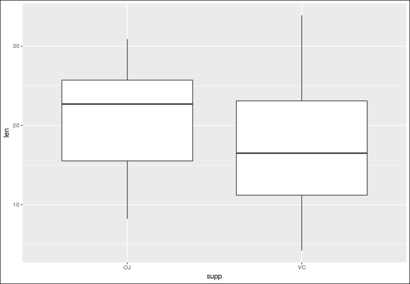
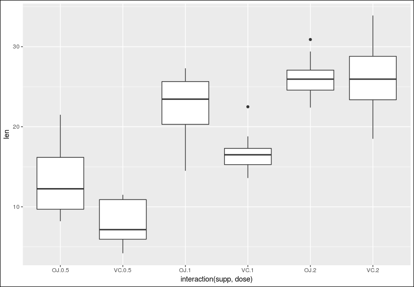
> qplot(interaction(supp, dose), len, data=ToothGrowth, geom="boxplot")
> ggplot(ToothGrowth, aes(x=interaction(supp, dose), y=len)) + geom_boxplot()
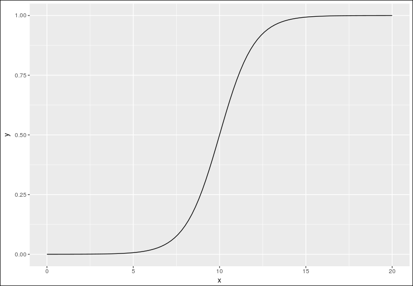
function curve
사용자 함수 정의하기
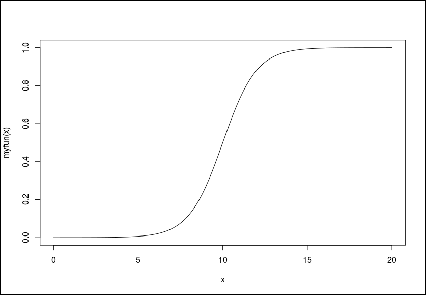
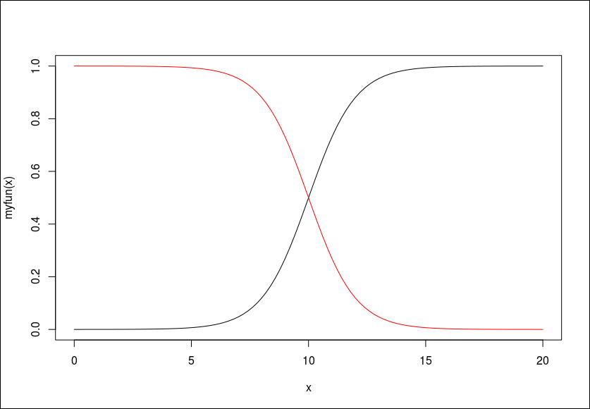
> library(ggplot2)
> # This sets the x range from 0 to 20
> qplot(c(0, 20), fun=myfun, stat="function", geom="line")
> # This is equivalent to:
> ggplot(data.frame(x=c(0, 20)), aes(x=x)) +
+ stat_function(fun=myfun, geom="line")